
Open this article in your favourite AI assistant


Color is one of the first things people notice about a brand. Before potential customers read your website, explore your products, or learn about your services, they subconsciously form an opinion based on your visual identity. The colors you choose can influence emotions, build trust, and even affect purchasing decisions.
Whether you’re creating a new company from scratch or refreshing an established brand, selecting the right color palette is an essential part of your branding strategy. Thoughtfully chosen colors help differentiate your business, improve recognition, and create a consistent experience across every customer touchpoint.
By understanding both color psychology and branding principles, you can develop a visual identity that reflects your company’s personality while encouraging long-term customer loyalty.
In this guide, we’ll walk through the key steps for selecting brand colors that align with your values, appeal to your target audience, and support your business goals.
STEP 1: Understand the Psychology Behind Brand Colors
Every color communicates something different. Color psychology explores how specific shades influence people’s emotions, perceptions, and behavior. In branding, these psychological associations help businesses shape how customers feel about their products and services before a single word is read.
The world’s most recognizable companies have proven that color alone can become a powerful brand asset. Over time, customers often associate certain colors with a specific company, making the brand instantly recognizable without seeing its logo.
Although color meanings may vary across cultures and industries, some emotional associations remain remarkably consistent. Understanding these associations will help you build a palette that supports the message your brand wants to communicate.
Red – Energy, Passion, and Action
Red is one of the most attention-grabbing colors in branding. It represents excitement, confidence, urgency, and power. Because it naturally stimulates emotion and increases energy levels, it’s frequently used to encourage quick purchasing decisions.
Brands that want to appear bold, dynamic, or highly competitive often rely on red as their primary color.
Best suited for:
- Food and beverage brands;
- Sports and fitness companies;
- Retail promotions;
- Entertainment businesses.

Pink – Warmth, Creativity, and Optimism
Pink is commonly associated with kindness, compassion, and youthful energy. Soft shades create a calm and elegant appearance, while brighter pinks communicate confidence, creativity, and playfulness.
Although traditionally connected with beauty and children’s products, modern brands increasingly use pink to express originality and inclusiveness.
Ideal for:
- Beauty and cosmetics;
- Fashion brands;
- Lifestyle businesses;
- Children’s products;
- Creative startups.
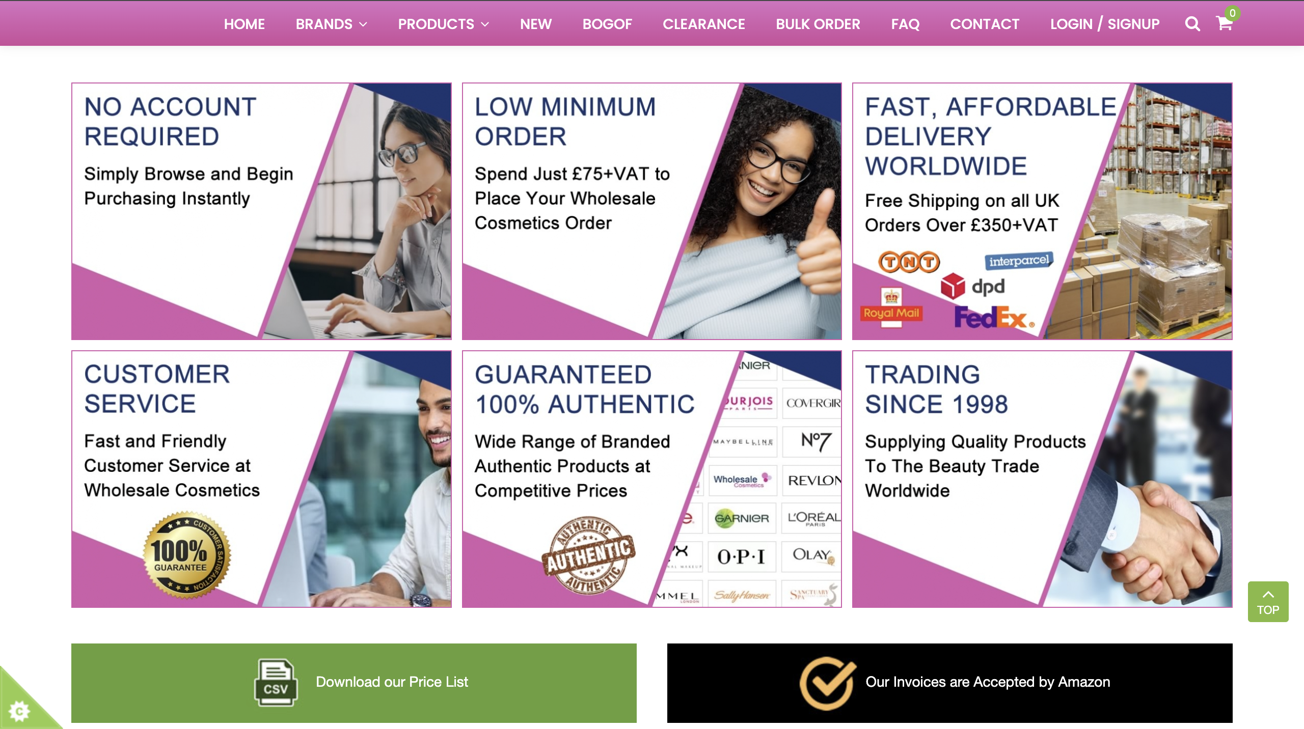
Orange – Innovation and Enthusiasm
Orange combines the energy of red with the optimism of yellow, creating a color that feels energetic, approachable, and adventurous.
It works particularly well for companies that want to appear innovative, affordable, and friendly. Technology startups, educational platforms, and entertainment brands frequently incorporate orange to communicate creativity and forward thinking.
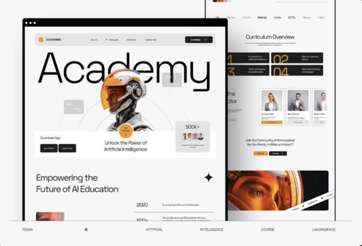
Yellow – Happiness and Visibility
Yellow naturally attracts attention and is associated with optimism, warmth, and positivity. Because it is highly visible, it’s often used to highlight important elements such as calls to action, promotions, or key brand features.
However, excessive use of bright yellow can overwhelm viewers, making it most effective as an accent color rather than the dominant shade.
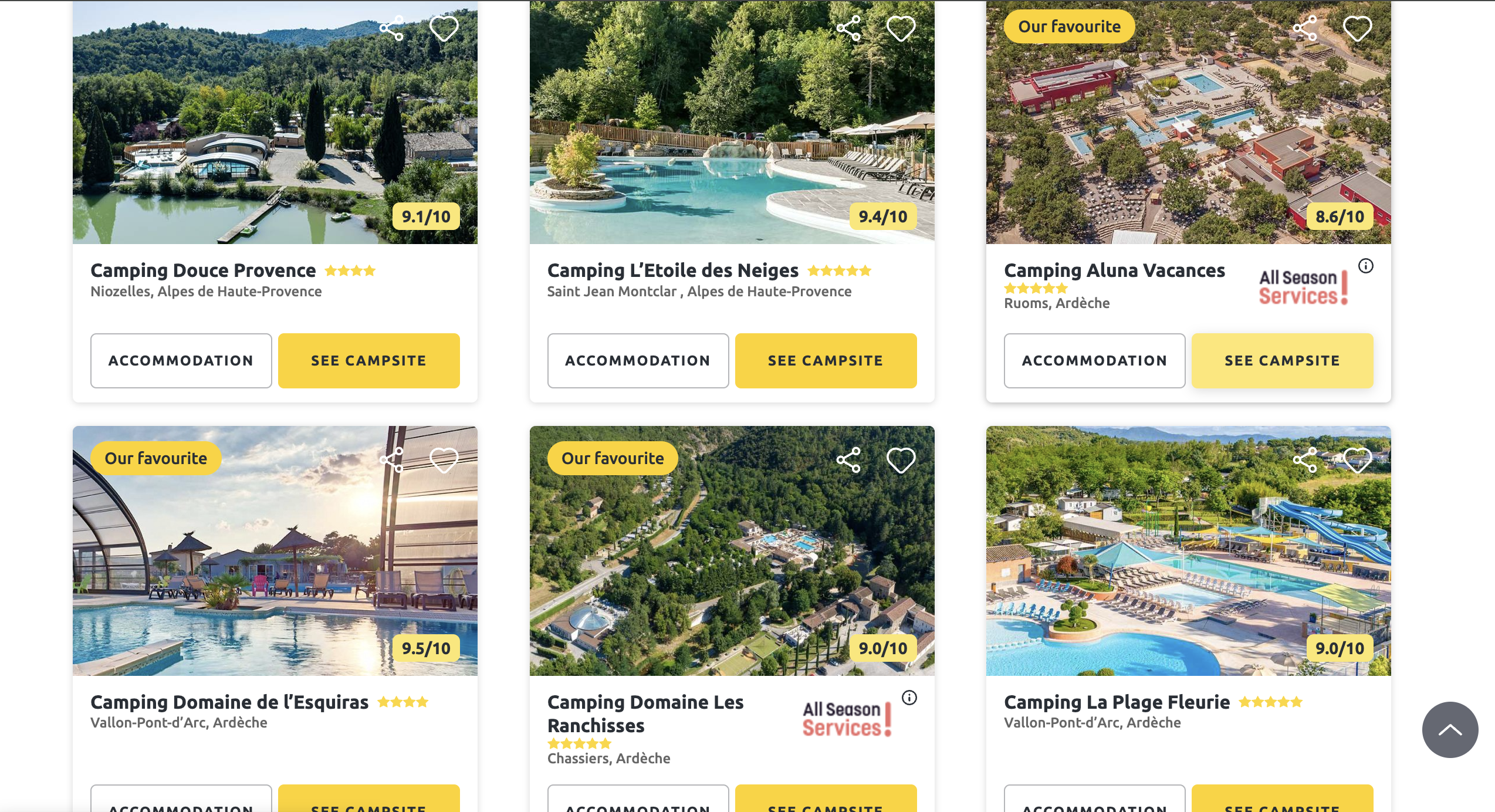
Blue – Trust and Reliability
Blue remains one of the most widely used colors in corporate branding. It conveys professionalism, stability, intelligence, and security, making it especially popular among financial institutions, technology companies, healthcare organizations, and software providers.
Lighter blues create a welcoming and peaceful impression, while darker shades project authority and confidence.
Green – Growth and Sustainability
Green is strongly connected with nature, health, renewal, and environmental responsibility. It is the preferred choice for brands promoting organic products, eco-friendly solutions, wellness, and sustainable business practices.
Depending on the shade, green can also symbolize prosperity, balance, and long-term growth.
Brown – Authenticity and Simplicity
Brown communicates reliability, honesty, and a connection to natural materials. It is frequently used by brands that emphasize craftsmanship, tradition, organic ingredients, or handmade products.
Earthy tones create a sense of warmth and authenticity that resonates with customers seeking genuine, sustainable experiences.

Purple – Luxury and Creativity
Purple has long been associated with royalty, prestige, imagination, and sophistication. Premium brands often use purple to emphasize exclusivity and elegance, while creative companies employ it to showcase originality and innovation.
Different shades can range from luxurious and mysterious to modern and artistic.
Black and White – Minimalism and Elegance
Black represents sophistication, authority, and premium quality, whereas white symbolizes simplicity, clarity, and purity.
Together, these timeless colors create a clean, minimalist aesthetic that works particularly well for luxury brands, technology companies, and modern design-focused businesses.
Multicolor Palettes — Diversity and Innovation
Using multiple colors allows brands to communicate inclusiveness, creativity, and versatility. A carefully balanced multicolor palette can represent diversity while making the brand feel energetic and accessible.
This approach is especially effective for digital platforms, creative services, and companies serving broad global audiences.
Ultimately, your brand colors should do more than look attractive – they should reinforce your identity, support your positioning, and create a memorable emotional connection with your audience.
Step 2: Learn the Basics of Brand Color Terminology
Choosing brand colors isn’t only about creativity – it also requires a basic understanding of color terminology. Whether you’re collaborating with designers, developers, or marketing specialists, speaking the same visual language makes the branding process much more efficient.
Understanding these concepts allows you to communicate ideas more clearly, request accurate revisions, and ensure your brand colors remain consistent across both digital and print materials.
Here are the essential terms every brand owner should know:
Hue
A hue is the pure version of a color before black, white, or gray are added. Traditional color theory identifies red, blue, and yellow as the primary hues from which countless other colors can be created.
Shade
A shade is produced by adding black to a base color, resulting in a darker, richer version. Darker shades often communicate strength, authority, and sophistication.
Tint
A tint is created by mixing white with a color, producing lighter and softer variations. Tints are commonly used to create friendly, modern, and approachable brand identities.
Tone (Saturation)
A tone changes a color by adjusting its saturation or by adding gray. Muted tones typically create a more refined, balanced appearance, while highly saturated colors feel energetic and bold.
HSL
HSL stands for Hue, Saturation, and Lightness. Designers frequently use this color model when building websites because it provides precise control over how colors appear on digital screens.
RGB and HEX
RGB (Red, Green, Blue) is the standard color model for digital displays, while HEX codes provide the hexadecimal values used in web development and design software. These formats ensure your brand colors remain identical across websites, emails, and mobile applications.
CMYK and Pantone (PMS)
For printed materials, designers rely on CMYK (Cyan, Magenta, Yellow, and Black) or the Pantone Matching System. These standards help reproduce colors accurately on brochures, packaging, business cards, signage, and other physical marketing materials.
The more familiar you become with these terms, the easier it will be to maintain a consistent visual identity across every platform.
Once you’ve finalized your brand palette, it’s equally important to apply it consistently across your digital presence. Your website is often the first interaction customers have with your business, making it a critical extension of your brand identity. Investing in web design services from BAMS digital marketing studio can help ensure that your colors, typography, and overall visual language work together to create a professional, user-friendly, and conversion-focused online experience.
Step 3: Analyze Your Competitors’ Brand Colors
Before committing to a color palette, take time to evaluate how other companies in your industry present themselves. A competitive analysis helps you understand common visual trends while identifying opportunities to make your brand more distinctive.
Customers frequently compare similar products side by side, whether they’re browsing online stores or walking through retail aisles. If your branding closely resembles everyone else’s, it becomes much harder to capture attention.
Instead of copying competitors, study the reasoning behind their color choices.
Ask yourself the following questions:
- Which colors dominate the industry?
- What emotions do competitors try to communicate?
- Are premium brands using darker, more sophisticated palettes?
- Do budget-friendly businesses rely on brighter, energetic colors?
- Which brands are immediately recognizable because of their color schemes?
Beyond visual analysis, review customer feedback, social media discussions, and product reviews. These sources often reveal how audiences perceive a company’s branding and whether its visual identity supports its reputation.
Look for recurring patterns as well. You may discover that technology companies heavily favor blue, wellness brands prefer green, or luxury businesses consistently use black, gold, or deep purple.
However, following industry conventions shouldn’t prevent your brand from standing out.
For example, imagine you’re launching a sunscreen brand. Many competitors rely on blue, yellow, or white because these colors evoke sunshine, water, and summer vacations. While these associations make sense, using the same palette may cause your product to blend into a crowded marketplace.
If your sunscreen is manufactured using sustainable ingredients or eco-friendly packaging, incorporating green into your visual identity could better communicate your unique selling proposition and immediately differentiate your brand from competing products.
The goal isn’t to choose completely different colors simply for the sake of being different. Instead, select a palette that reflects your brand’s unique values while remaining relevant to your target audience.
A well-executed competitive analysis will help you balance familiarity with originality, making your brand easier to recognize and remember.
Step 4: Choose Brand Colors That Represent Your Business Identity
After analyzing your competitors and understanding color psychology, the next step is selecting a palette that accurately represents your brand.
Your colors should not be chosen simply because they look attractive. They should communicate your company’s personality, values, and goals while creating the right emotional response from your target audience.
A strong brand color strategy begins with a clear understanding of who you are as a business.
Start by creating a list of words and characteristics that describe your company. Consider your mission, products, audience, and the overall experience you want customers to have.
For example:
- Do you want your brand to feel innovative or traditional?
- Should customers see your business as professional or playful?
- Do you want to create a feeling of luxury, trust, excitement, or simplicity?
- What emotions should people associate with your company?
These questions help move the decision-making process away from personal preferences and toward a strategic approach.
A common mistake businesses make is choosing colors they personally like instead of colors that effectively communicate their brand message. A color may look appealing individually but fail to represent the company’s positioning.
Build a Color Strategy Around Your Brand Goals
Think about the response you want your audience to have when they encounter your brand.
If your goal is to make customers feel confident and secure, colors like blue or deep green may support that message. If your brand focuses on creativity and innovation, brighter shades such as orange, purple, or yellow may be more appropriate.
Your chosen palette should align with:
- Your brand personality;
- Your target audience;
- Your industry expectations;
- Your marketing objectives;
- Your competitive positioning.
For example, an organic food company may naturally consider brown because it represents natural materials and earth-friendly products. However, if the company’s main focus is modern sustainability and innovation, green or orange may better communicate those values.
The final palette might combine green as the primary color with brown and yellow as supporting accents, creating a balance between environmental responsibility and energy.
Use Color Tools to Create the Perfect Brand Palette
Finding the right combination of colors can be challenging, especially if you don’t have a design background. Color wheels and palette generators can simplify the process by helping you discover combinations that work well together.
These tools allow you to experiment with different shades, compare variations, and identify exact color codes for future use.
When creating your palette, consider including:
- A primary brand color;
- Secondary supporting colors;
- Accent colors for highlights;
- Neutral colors for backgrounds and typography.
A balanced palette gives your brand flexibility while maintaining consistency across different platforms.
Your chosen colors will eventually appear throughout your entire digital ecosystem, including your website, social media, advertising campaigns, and online materials. A professionally designed website ensures these elements work together effectively, helping visitors recognize your brand and navigate your content easily. Companies that specialize in professional web design services can help transform your visual identity into a cohesive digital experience that supports both branding and business growth.
Step 5: Apply Your Brand Colors Consistently Across All Designs
Selecting your brand colors is only the beginning. The next challenge is using them consistently across every customer interaction.
A strong brand identity depends on repetition. When customers repeatedly see the same colors across different platforms, they begin to recognize and remember your business more easily.
To maintain consistency, create clear brand guidelines that explain how and where your colors should be used.
These guidelines should define:
- Which colors are primary and secondary;
- When specific shades should be applied;
- Which combinations should be avoided;
- How colors should appear in digital and printed materials.
Your brand colors may appear across many different areas, including:
- Logo design;
- Website pages;
- Email marketing;
- Social media graphics;
- Online advertisements;
- Product packaging;
- Business cards;
- Office materials;
- Events and presentations;
- Employee uniforms.
Every touchpoint should feel like part of the same brand experience.
Consider Customer Emotions When Applying Colors
Different platforms may require different approaches. A color combination that works well on packaging may not always be ideal for a website interface.
For example, a bright red shade may be effective for promotional banners because it creates urgency and attracts attention. However, using too much red throughout a website could feel overwhelming.
Digital experiences require careful balance between visual impact and usability. Your website colors should support readability, accessibility, and user engagement while still reflecting your brand identity.
A thoughtful web design approach ensures that brand colors enhance the customer journey instead of distracting from it. By combining strategic color choices with effective web design services, businesses can create online experiences that feel professional, memorable, and aligned with their overall marketing goals.
Create Clear Brand Color Guidelines
A successful brand color strategy requires more than selecting a few attractive shades. It requires a structured system that helps everyone represent your brand consistently.
Creating detailed color guidelines gives your team a reliable reference point when designing marketing materials, updating digital content, or creating new campaigns.
Your brand guide should include:
- Exact color codes for digital use (RGB and HEX);
- Print specifications (CMYK and Pantone values);
- Examples of correct and incorrect usage;
- Approved color combinations;
- Templates and design examples.
These guidelines are especially valuable when working with larger teams, freelancers, agencies, or external partners.
Your color guidelines should also work together with other elements of your branding, including:
Brand Voice
The tone you use when communicating with customers should match the emotions created by your visual identity. A playful color palette should support a friendly communication style, while a premium palette should align with a more sophisticated tone.
Typography
Fonts and colors should complement each other. Establish which colors are used for headlines, body text, buttons, and other important design elements.
Images and Visual Content
Photography, illustrations, icons, and graphic elements should follow the same visual direction as your brand colors.
When all these elements work together, your brand becomes more recognizable and memorable.
Choosing the right colors is an investment in your company’s future. A strategic palette can help attract the right audience, strengthen trust, and turn casual visitors into loyal customers.
By combining color psychology, competitive research, and consistent application, you can create a visual identity that supports your business goals and leaves a lasting impression.